Samsung Home Theater Connection Widget
Wirewize was a revolutionary platform. It did what no other software before or since has been able to do: deliver customized, step-by-step connection instructions to help consumers connect their home entertainment devices. What needed to be done was completely redesign the user interface, incorporating the learnings that we had acquired over the 2+ prior years on the version 1 platform, to make the tool easier to use for consumers, easier to deploy for our clients, and better at capturing behavioral data from users to aid us in prioritizing aggregation of consumer electronics data, among other things.
I worked over several iterations to solve each of the problems that we faced with the existing platform, taking into account both the users' experiential needs and company's business requirements. Initially, I was able to solve one of the core issues for users: not being able to find their exact product in our database. This often resulted in abandonment of the system. This was also a problem for the company which was to a large extent unable to determine why users were abandoning the system. This was a huge improvement, but it still took too many steps to get to the finish line.
The breakthrough idea I had was in re-imagining the tool as a widget. In a widget, you have formidable constraints to deal with. But constraints often lead to the most effective designs. In the end, I was able to craft a design that could take the user through the entire setup process without the need for a single screen refresh. Users enter their brands and model numbers in an auto-completing free-form text field as opposed to the original drop-down menus. This allows us to recommend alternative, closest-matching models when the exact requested model is not available, but also gives insight into what models our users search for so that priority can be given to the most popular models.
The widget is highly portable on the web, but even better, the entire metaphor in use can be easily be translated to enable a consistent experience on the Web, mobile platforms, and TV screen, with only minor modifications necessary to accommodate the different input methods.
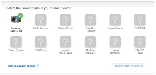
This shows the what the widget would look like with a single component, a Samsung TV, as part of the system. In this case, the TV is automatically added to the system because it has been launched from within the Samsung TV product page.
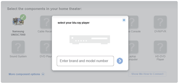
The product selection overlay is invoked by the user clicking on "Blu-ray Player" from the underlying product category matrix.
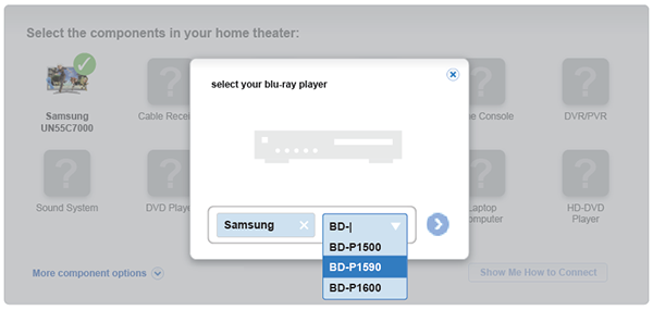
Brands and model numbers are auto-completed from our product database.
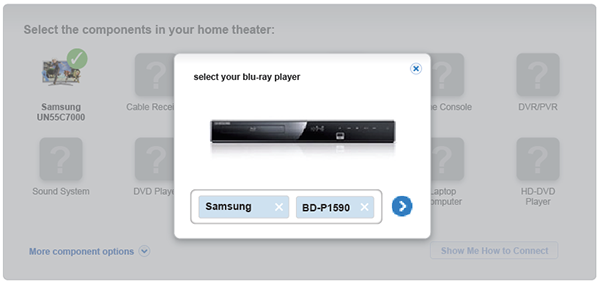
The selected product is displayed, ready for the user to confirm adding it to her system.
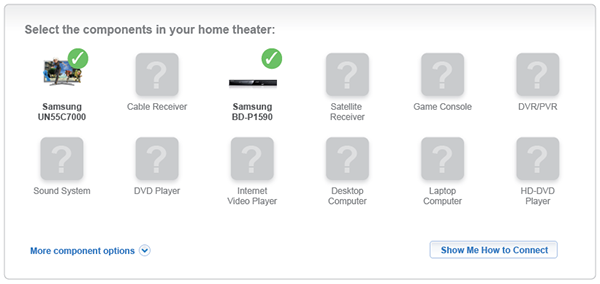
The widget recognizes a valid system and makes the "Show Me How to Connect" button available to click.
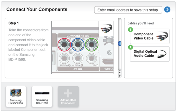
Customized connection instructions, along with a list of the cables that are needed are displayed for the user. Entering an email address in the form above the cables saves the system into a "system locker" that the user can go access in the future to add other components or make other changes.